Improving Anscombe's quartet
I’m a fan of Anscombe’s Quartet. As much as I like it, it has a teaching problem, so let’s try to improve upon this great data set. As intended by its creator Francis Anscombe, the quartet shows that you should never, never (did I forget to say “never”?) blindly use statistical estimates. Instead you should check your implicit assumptions by making charts of your data. Anscombe’s quartet furthermore makes clear that outliers can heavily bias your statistical result.
The anscombe dataset is shipped with R:
data("anscombe")
head(anscombe, 3)
  x1 x2 x3 x4   y1   y2    y3   y4
1 10 10 10  8 8.04 9.14  7.46 6.58
2  8  8  8  8 6.95 8.14  6.77 5.76
3 13 13 13  8 7.58 8.74 12.74 7.71
In which x and y’s all have the same mean (9.0,7.5) and variance (11.0, 4.1). Each
of the data sets has \(\beta_0 = 3.0\) and \(\beta_1 = 0.5\).
I often use the quartet in data visualization courses. I start with slides showing the data, their identical stats and ask if the students think the four datasets are similar, before showing the plots: I try to lure them into the trap of blindly trusting statistical estimates, without checking their validity in the hope that the message will stick (and of course many students are suspicious that there is a catch).
Before introducing the didactic flaw (just a little bit more patience…),
you can see that the anscombe R data set is not in a
“handy” or tidy format: the x and y variables for each dataset are stored in different columns.
A more tidy data-model would be a dataset with columns “set”,“x” and “y”.
Teaching problem
The Anscombe dataset contains four different data sets each describing the abstract variables \(x\) and \(y\) having arbitrary values. \(x\) and \(y\) may be a statistician/mathematician’s default naming convention, but makes the data set difficult to relate to and gives it an artificial smell. Key in data analysis/data science/applied statistics is that you understand the data, know what it is about, have some idea of typical values and have a grasp of its applicability. This is missing in Anscombe’s great data set, so here an attempt to improve on that point. Lets tweak the data set so that it becomes more “alive”. Lets turn the data set from Anscombe’s quartet into Anscombe’s quarters.
Anscombe’s quarters1 (fiction)
The city council of Anscombe ordered a small survey to monitor the socio-economic differences between its districts. Although a wealthy city, the council had concerns that there were large differences in (average) income as well as (average) age. It would also be interesting to know if there was a relation between age and income. Luckily one of the council members living in the Eastern quarter had an old class-mate that did market-research. He conducted the survey and quickly returned with the results.
The council was pleased with the outcome of the survey:
| district | income_mean | income_sd |
|---|---|---|
| Northern quarter | 60k$ | 16.3k$ |
| Southern quarter | 60k$ | 16.3k$ |
| Western quarter | 60k$ | 16.2k$ |
| Eastern quarter | 60k$ | 16.2k$ |
The district had the same average income, but what about age?
| district | age_mean | age_sd |
|---|---|---|
| Northern quarter | 36 | 13.3 |
| Southern quarter | 36 | 13.3 |
| Western quarter | 36 | 13.3 |
| Eastern quarter | 36 | 13.3 |
The districts also had the same average age! As an extra check the analyst had provided the (linear) relation between age and income per district:
anscombe_d %>%
  split(.$district) %>%  # split per district
  sapply(function(d){
    lm(income ~ age, data = d) %>%
      coef() %>%
      round(1)
  }) %>%
  t() %>%
  as.data.frame()
                 (Intercept) age
Northern quarter          24   1
Southern quarter          24   1
Western quarter           24   1
Eastern quarter           24   1
So for each year in age, the income increased with 1.000 dollars. So the council was assured that there were absolutely no differences, but should they?
On his birthday party the council member was shocked to find out that many of his old class-mates, were interviewed for the survey by their mutual friend. So he decided to plot the data:
ggplot(anscombe_d, aes(x = age, y = income)) +
  geom_point() +
  geom_smooth(method="lm", se = T, col="red", alpha=0.1) +
  facet_wrap(~ district) +
  scale_y_continuous(labels = function(x){paste0(x, "k$")})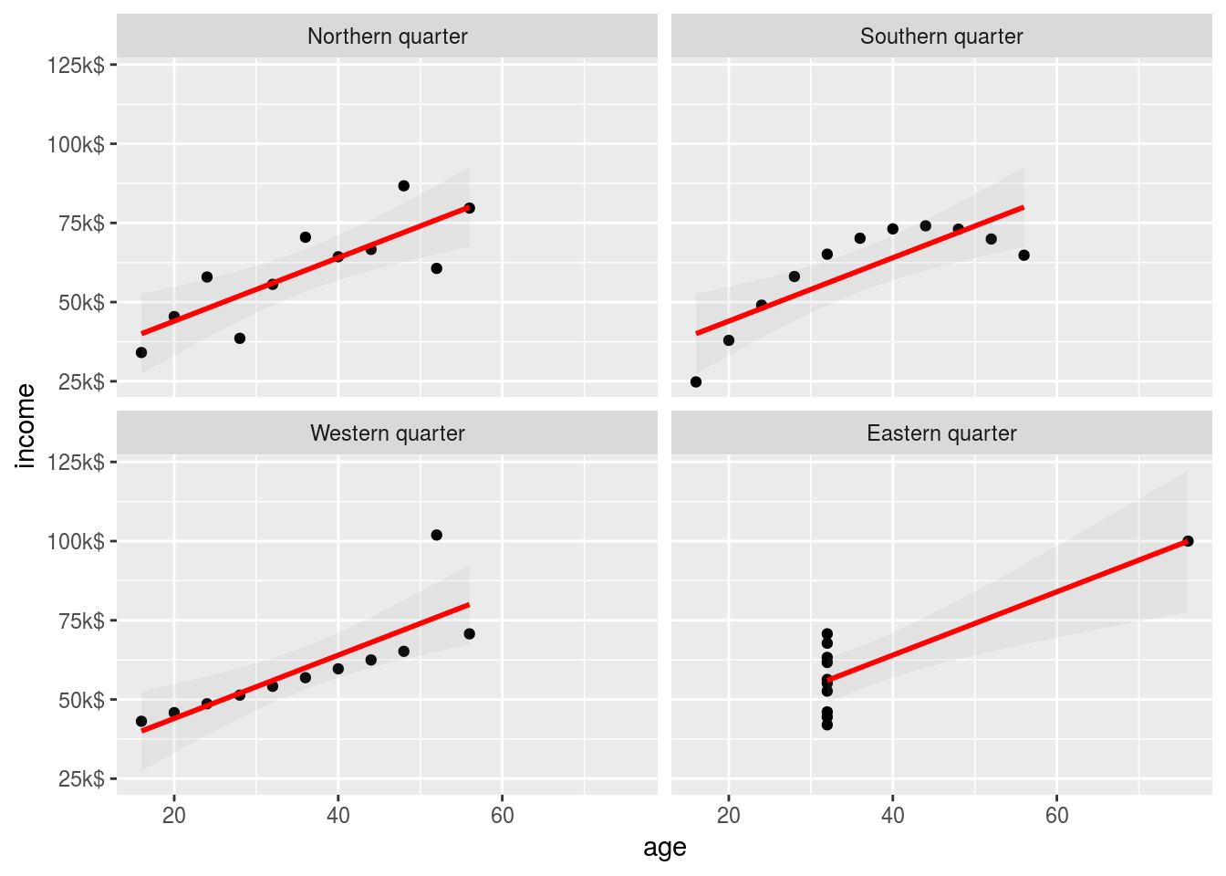
The districts are clearly not equal! The data for the Eastern quarter is suspicious, but the relation between age and income is only valid for the Northern quarter. Always confront you analysis with making plots!
Exit
This story may be old hat for you, but for novice data scientist I hope this reformulation offers a work case they can relate to.
Feedback and/or further improvements are welcome!
Derivation of dataset
The anscombe_d dataset is derived the following way:
library(tidyverse)
anscombe_d <-
  anscombe %>%
  mutate(row = row_number()) %>% # needed for long -> wide
  gather(var, value, -row) %>% # wide -> long
  separate(var, into=c("var", "ds"), sep = 1) %>%
  spread(var, value) %>%  # long -> wide
  mutate( district = factor(ds, 1:4, paste0(c("North", "South", "West", "East"), "ern quarter"))
        , income   = 8 * y # make income in range: [24k-101k]
        , age      = 4 * x    # make age in range: [16-76]
        ) %>%
  select(district, age, income)

head(anscombe_d)
          district age income
1 Northern quarter  40  64.32
2 Southern quarter  40  73.12
3  Western quarter  40  59.68
4  Eastern quarter  32  52.64
5 Northern quarter  32  55.60
6 Southern quarter  32  65.12
Incidentally in some languages quartet is semantically connected to a synonym for district: quartier (fr), quarter (en), kwartier (nl), Viertel (de).↩